Playfulness
My House of Design
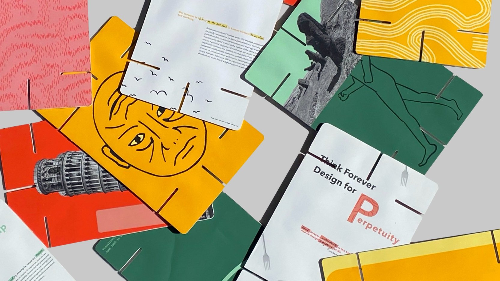
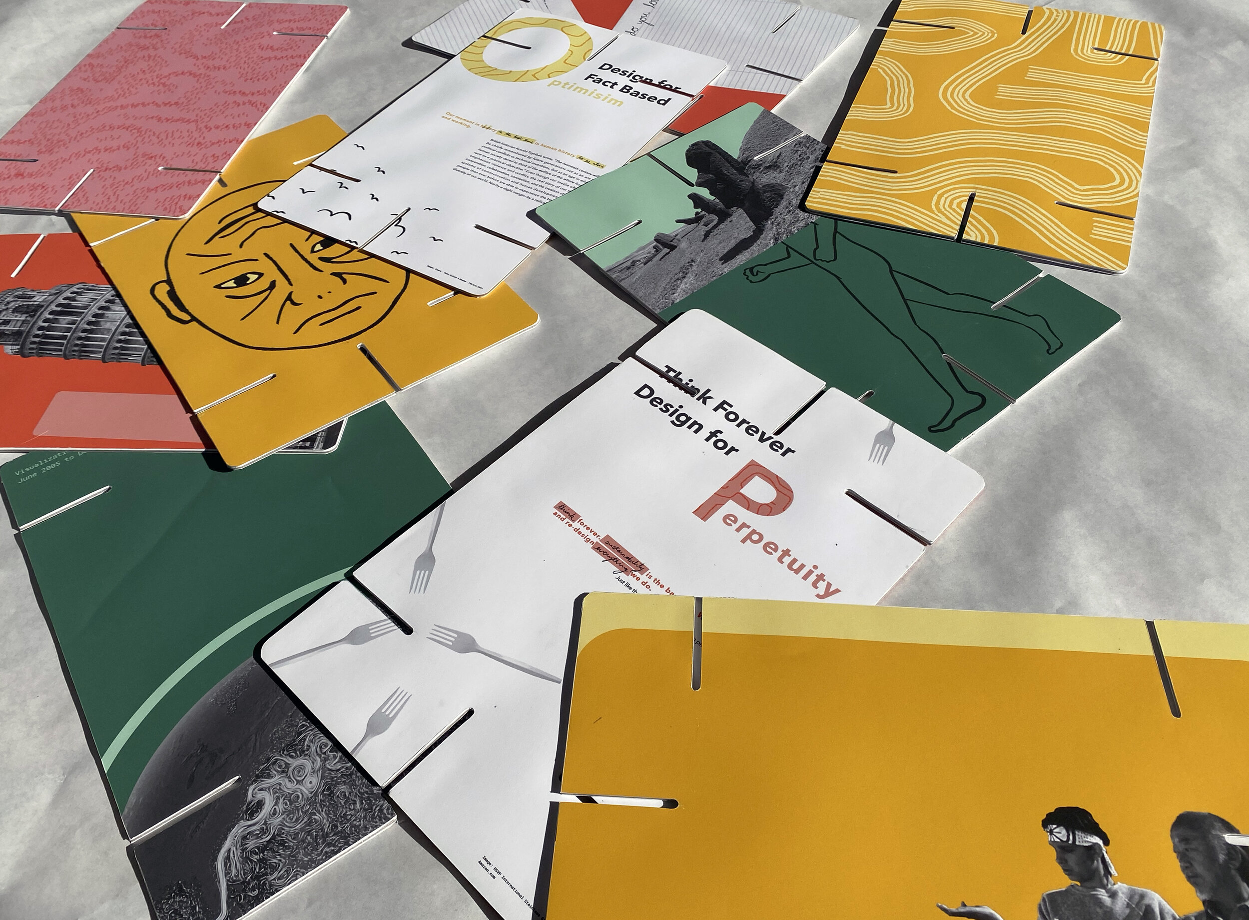
Fall 2019Using the Eames’ House of Cards as a conceptual starting point, I created a typographic and visual system that encapsulates “my house of design.”
My cards are a visualization of Canadian designer and educator Bruce Mau’s essay 24HRS Massive Change Toolkit of Insights, Methods, and Creative Strategies. In using Mau’s words and methodologies for approaching my design, my cards are an interpretation of both Eames’ playful utility and Mau’s methods.
In 1952, designers Charles and Ray Eames created a set of 7’’x11’’cards with slots designed to be fit together and played with by the user. Each face is printed with different images or patterns and once assembled they create interesting intersections and juxtapositions. Their cards were created to show their appreciation for “beauty in the ordinary.” They act as a discussion point, a social object between users, or simply a tool for play.
“Toys are not really as innocent as they look. Toys and games are preludes to serious ideas.” – Charles & Ray Eames

Concept: Playfulness
The first task was to read through Mau’s essay and choose the principles that most resonated with me. The goal of the project was to make the cards represent myself through the lens of design and Mau’s insightful words. I wanted the overall concept and visuals to be based around playfulness because it is essential to my design approach. I work to solve problems and create visuals that allow flexibility and personal exploration. I find this lively approach can help make serious subjects more accessible for discussion. In order to get my vision across, I created a whimsical set of heuristics and then intentionally broke them.


Typography
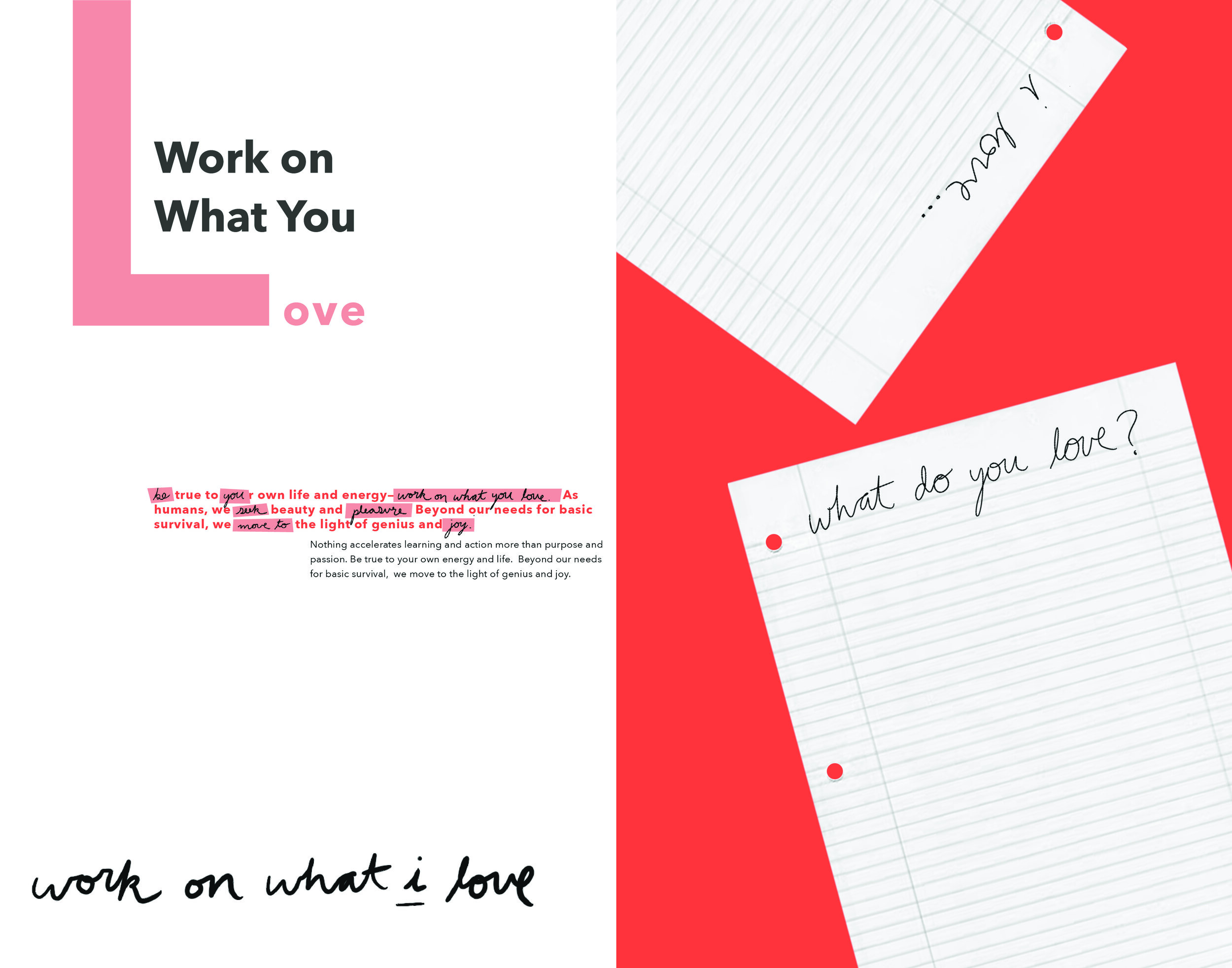
The cards have a distinct grid system based on the location of the slots and the card proportions. I began by making a very simple and static base system of type and layout (header, subhead, and body). I then found different ways to disrupt that system. For each of Mau’s principles there is a sentence or two that acts as a simple summary to the rest of the text. To support my overall goal, I wanted to incorporate my voice with Mau’s. To do this I chose certain words to replace with my handwriting. The handwritten words, if read alone, are an even shorter and more playful version of the original. In the example below, my interjected voice says: “be you. work on what you love. seek pleasure. move to joy.” My handwriting carries my voice throughout the rest of the cards.
Another typographic strategy I incorporated was experimenting with the placement, size and orientation of the title. Keeping in mind the static nature of the bottom half of the cards, I knew the title could be more expressive. Not to appear too overwhelming, only one word from the title changed significantly and was emphasized with different colors and sizes.

Illustration & Pattern
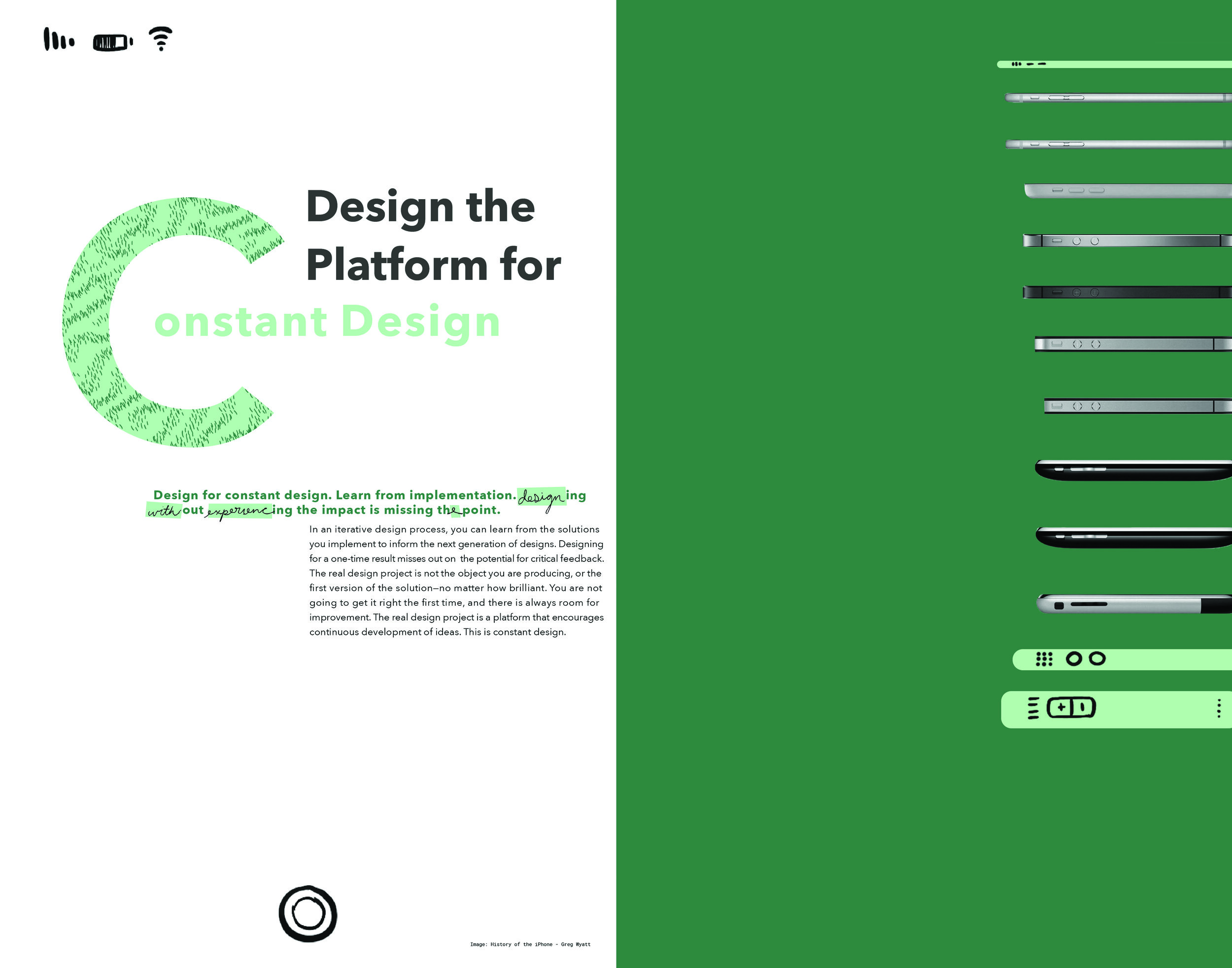
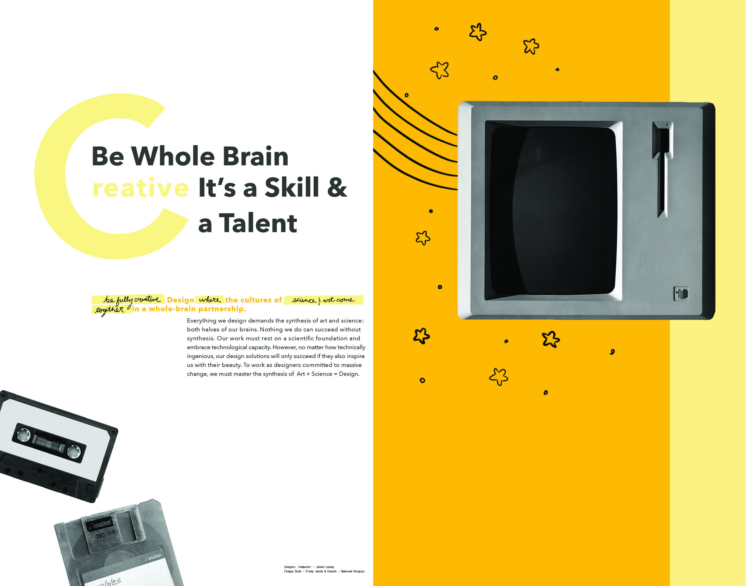
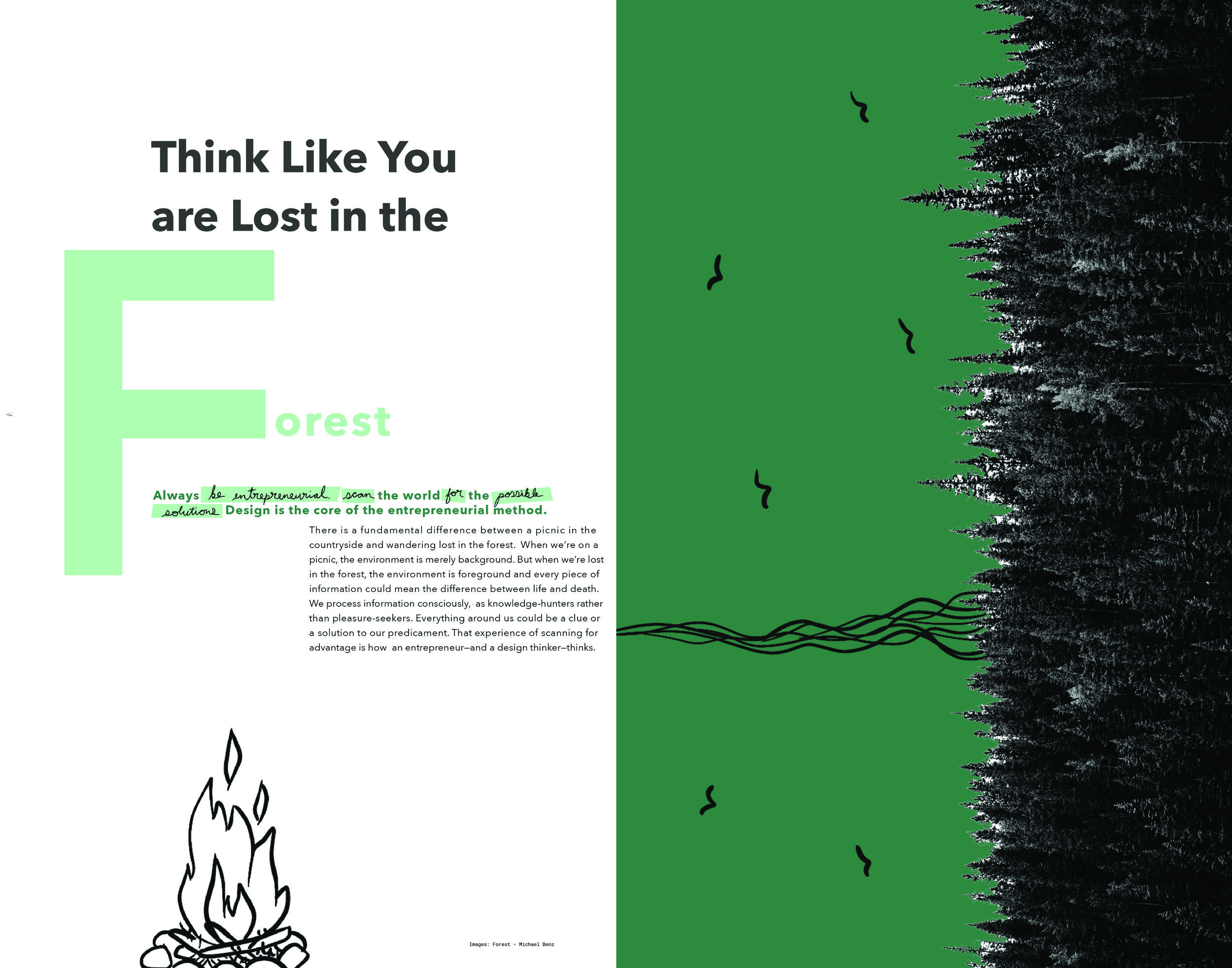
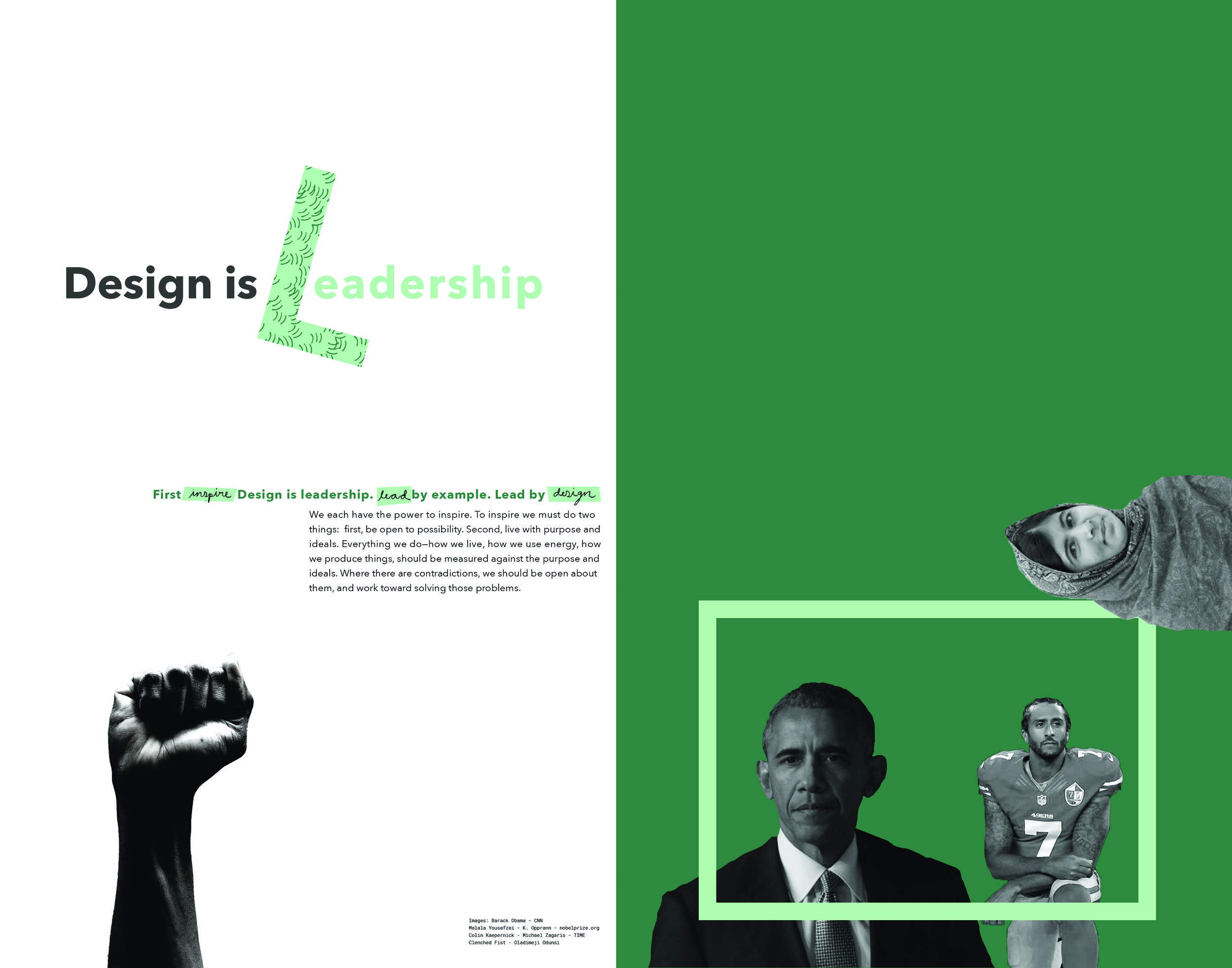
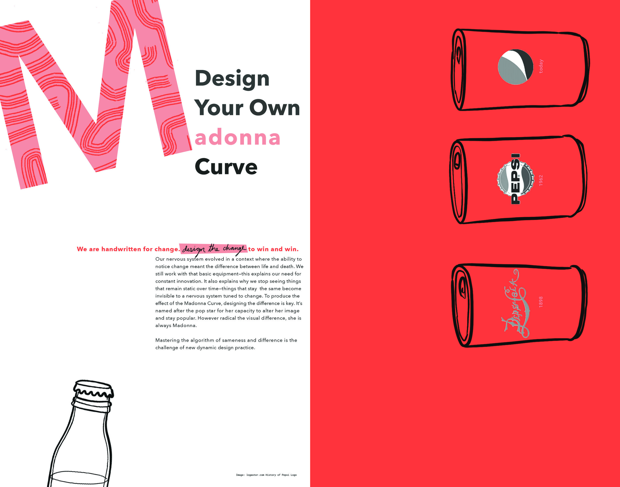
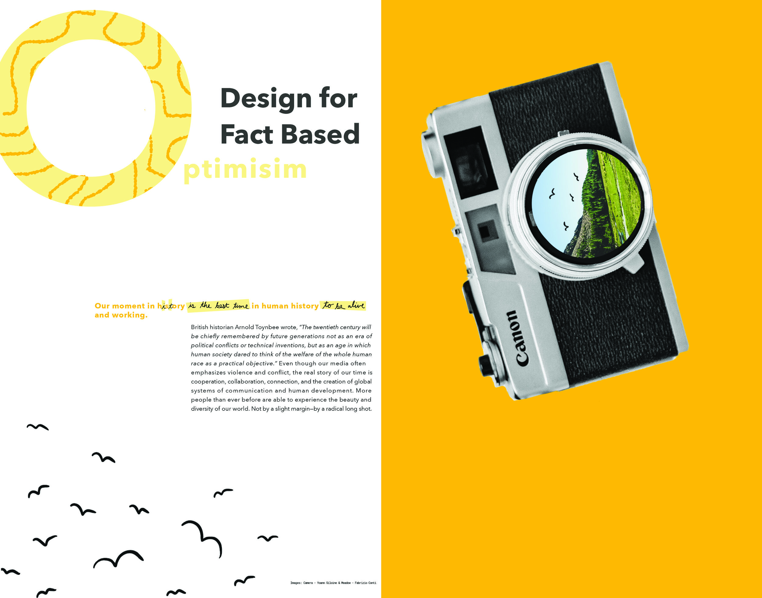
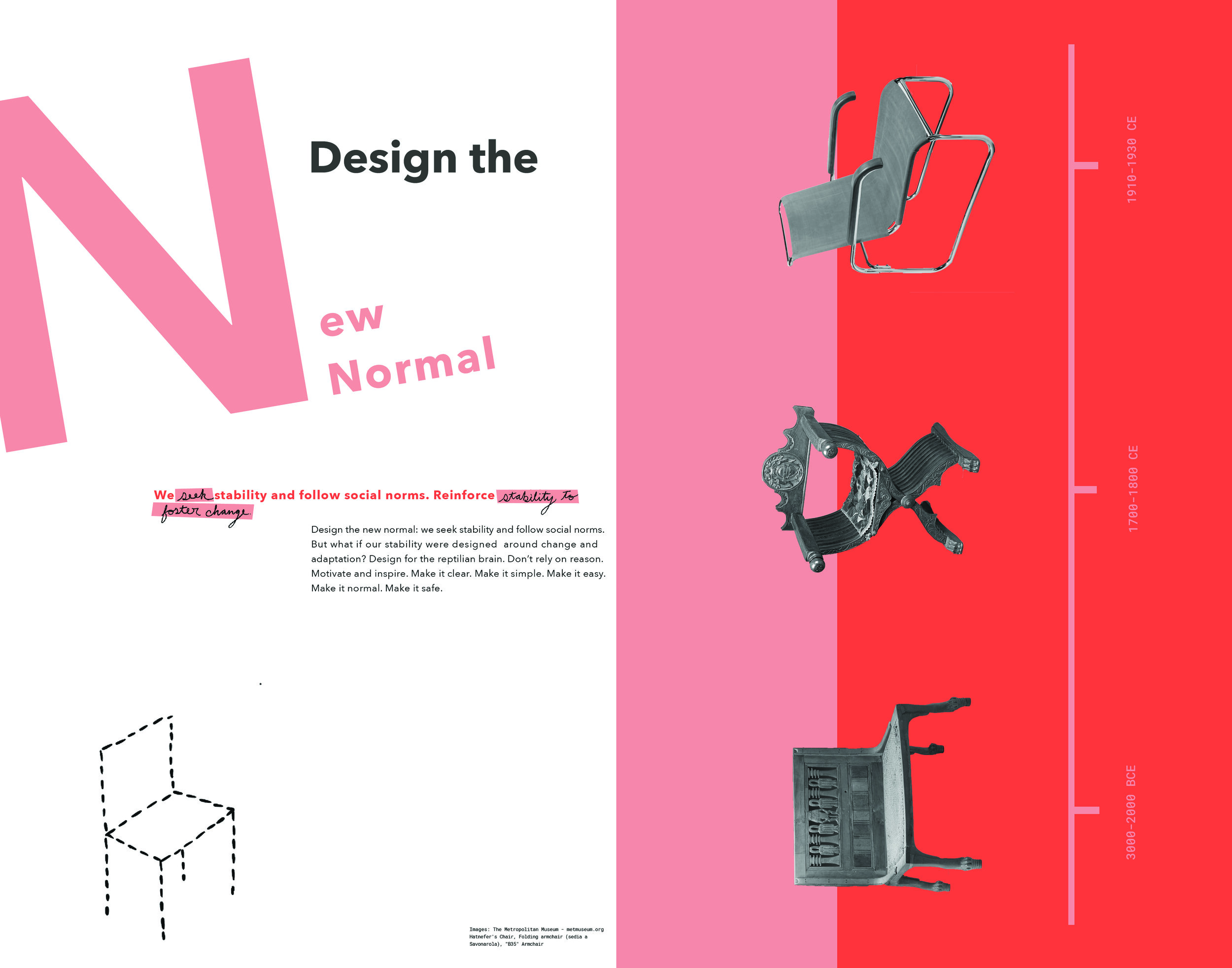
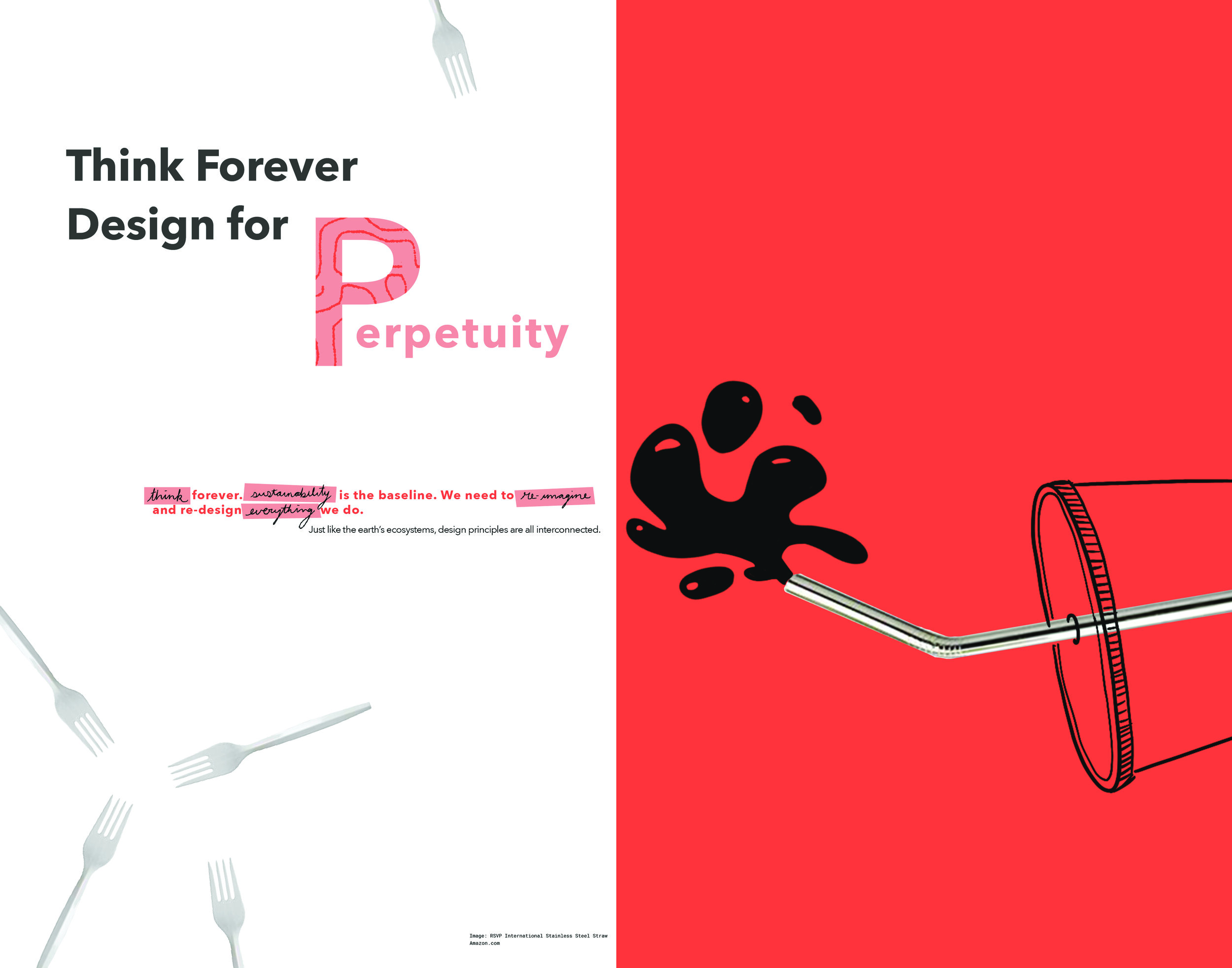
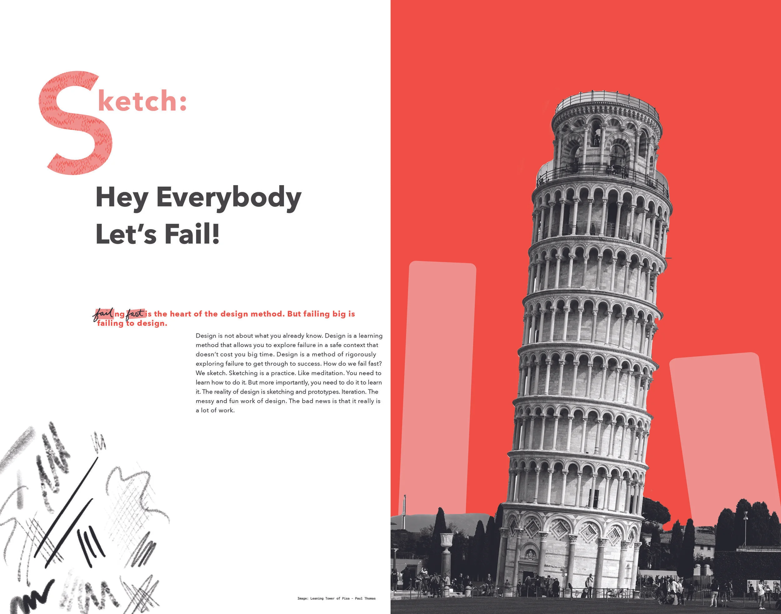
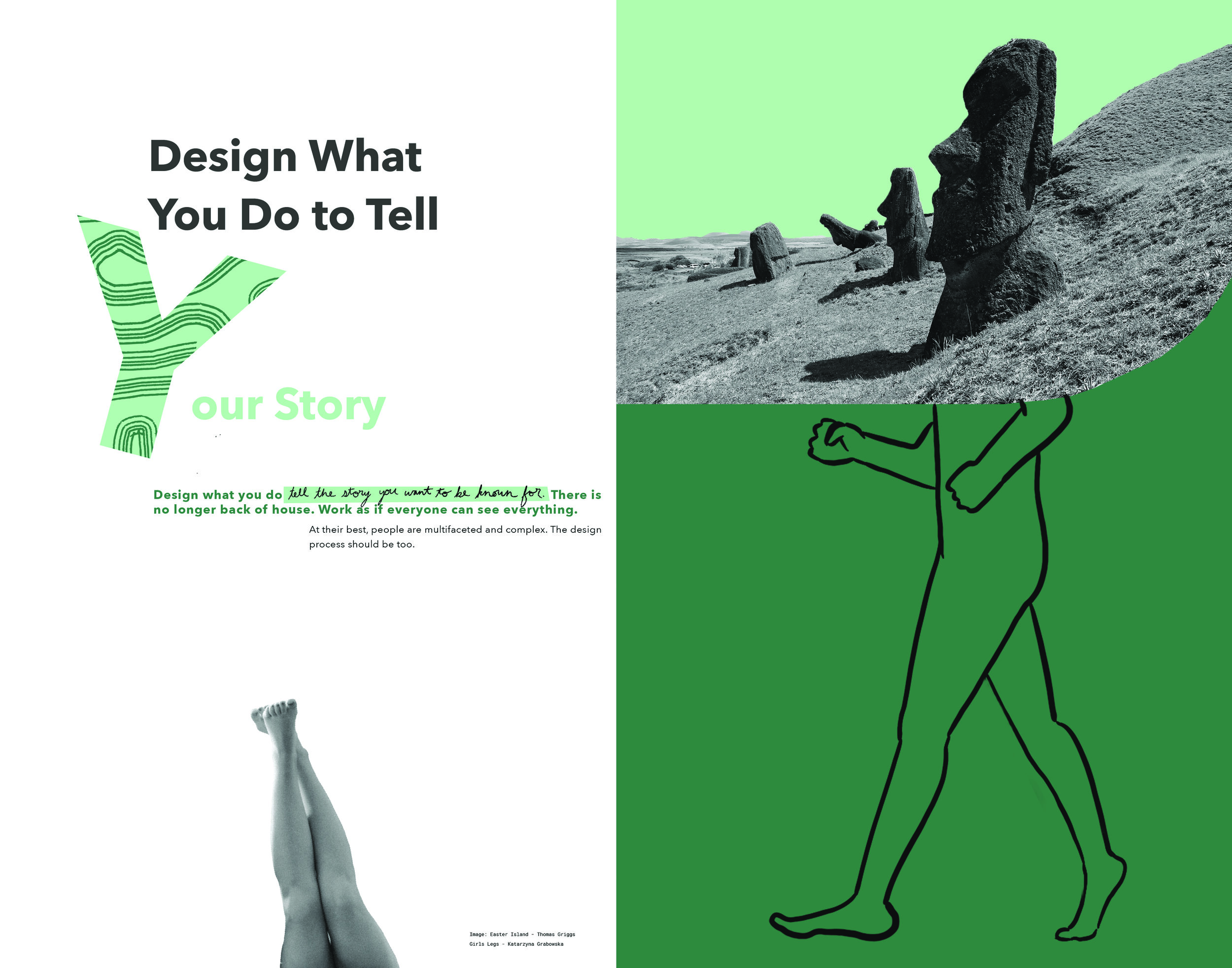
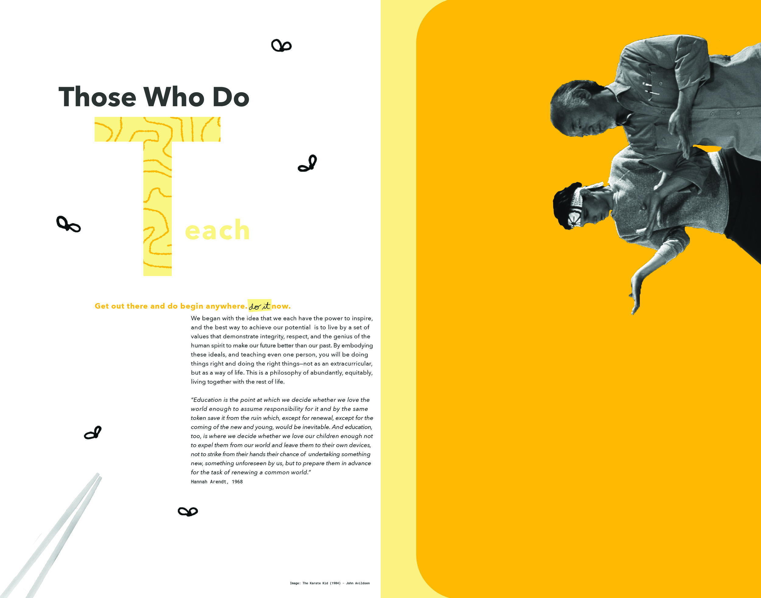
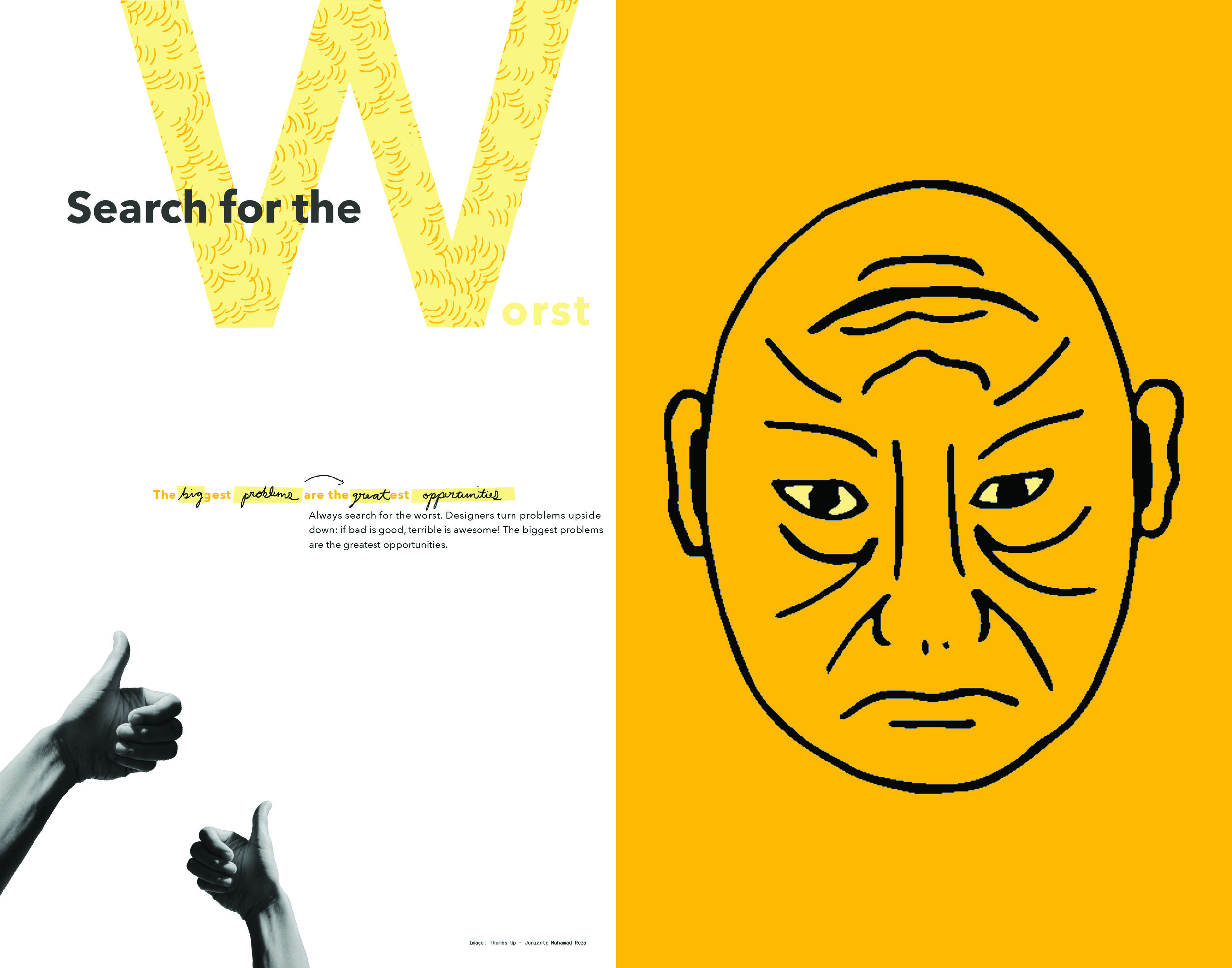
My cards feature text on one side and a corresponding illustration on the other side. This gave me another opportunity to bring my style into action. A defining motif throughout my design was to take pre-existing content (image and text) and add my own spin to it. My voice is represented by the doodles or overlayed handwriting on Mau’s text. When deciding the content of cards, I started by finding a generic, more obvious visual for the corresponding principles. For example, on the sustainability card, I chose a metal reusable straw, something I knew many people would recognize as a symbol of sustainability. To make it more of my point of view, I incorporated simple line illustrations on the image. In the straw example, a drew a black liquid leaking out of the straw reminiscent of oil (which is obviously not very sustainable). In other illustrations I used pop culture references or iconic imagery that fit, like the Leaning Tower of Pisa for the section on failing (sorry Bonanno Pisano), and images of President Obama and Malala Yousafzai as symbols of inspirational leaders. Lastly, I created illustrations that were metaphors for my interpretation of Mau’s principle. For example, one card is titled “design what you do to tell your story.” This principle is about how problems and designers are multifaceted, and there usually is more than meets the eye. To illustrate this, I used the iconic Easter Island Moai statues and imagined what the lower part of their bodies might look like if uncovered. To further connect both sides of the cards, I came up with small supplemental illustrations to go on the side with the text. I wanted these illustrations to be subtle and a hint to what might be on the other side.
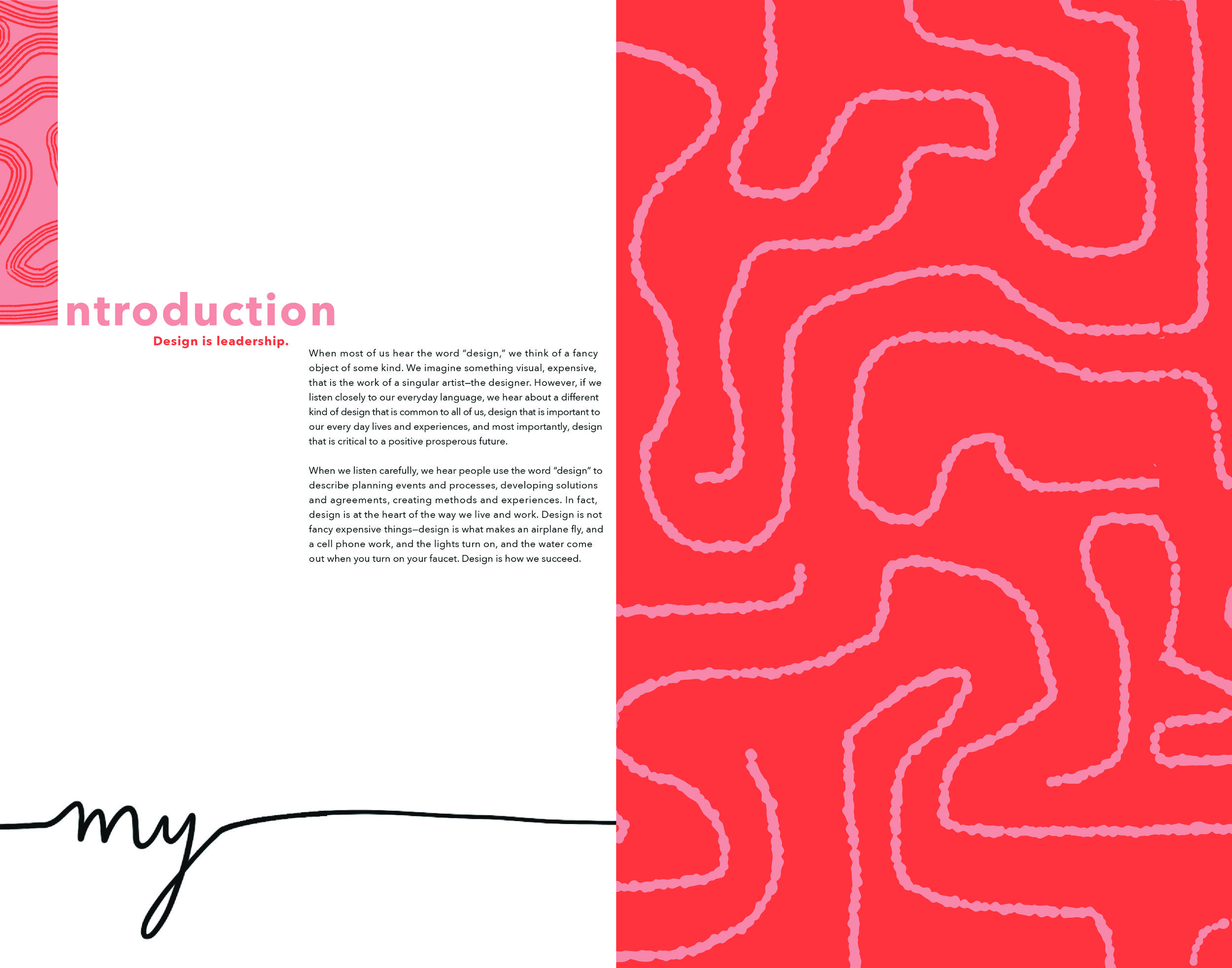
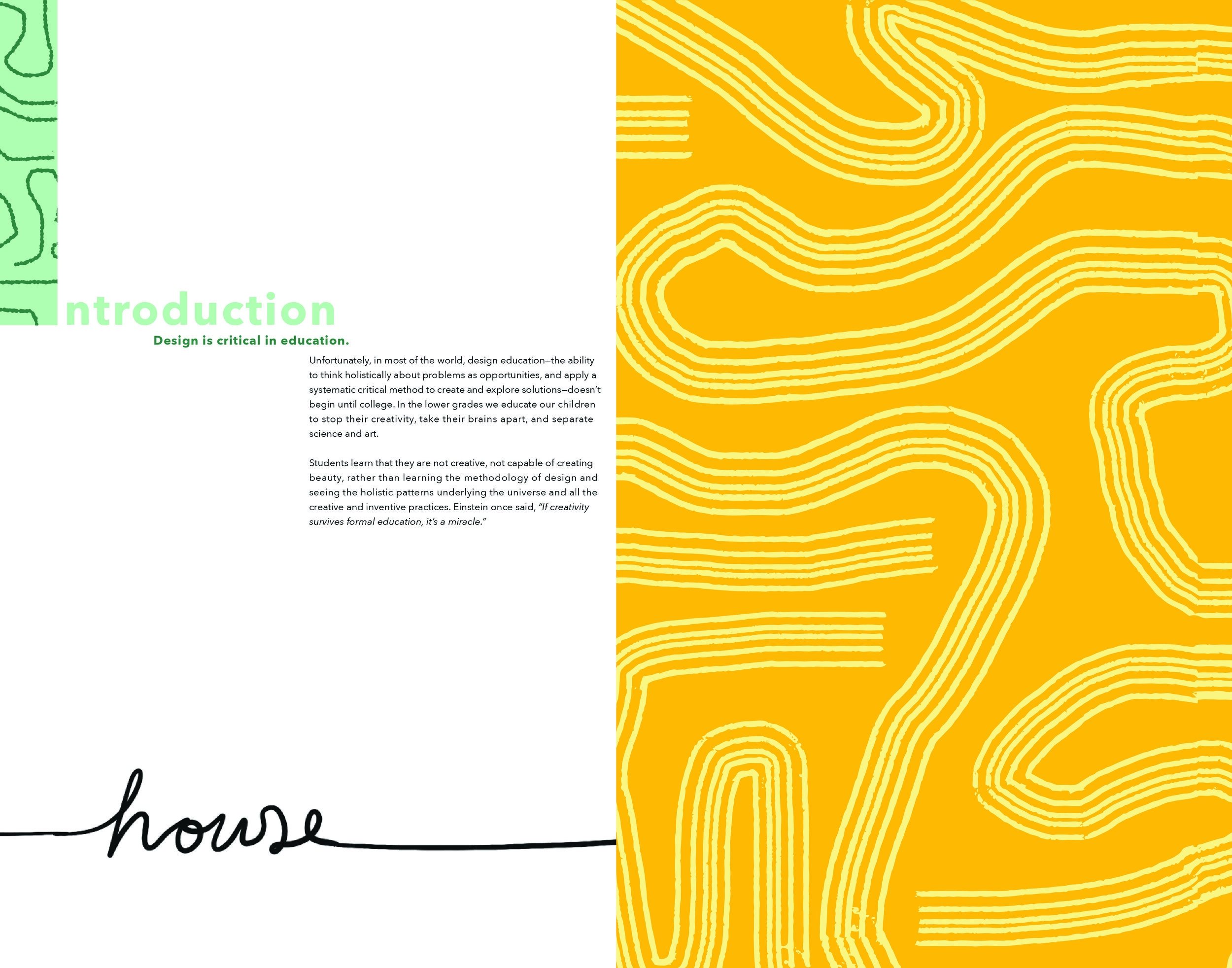
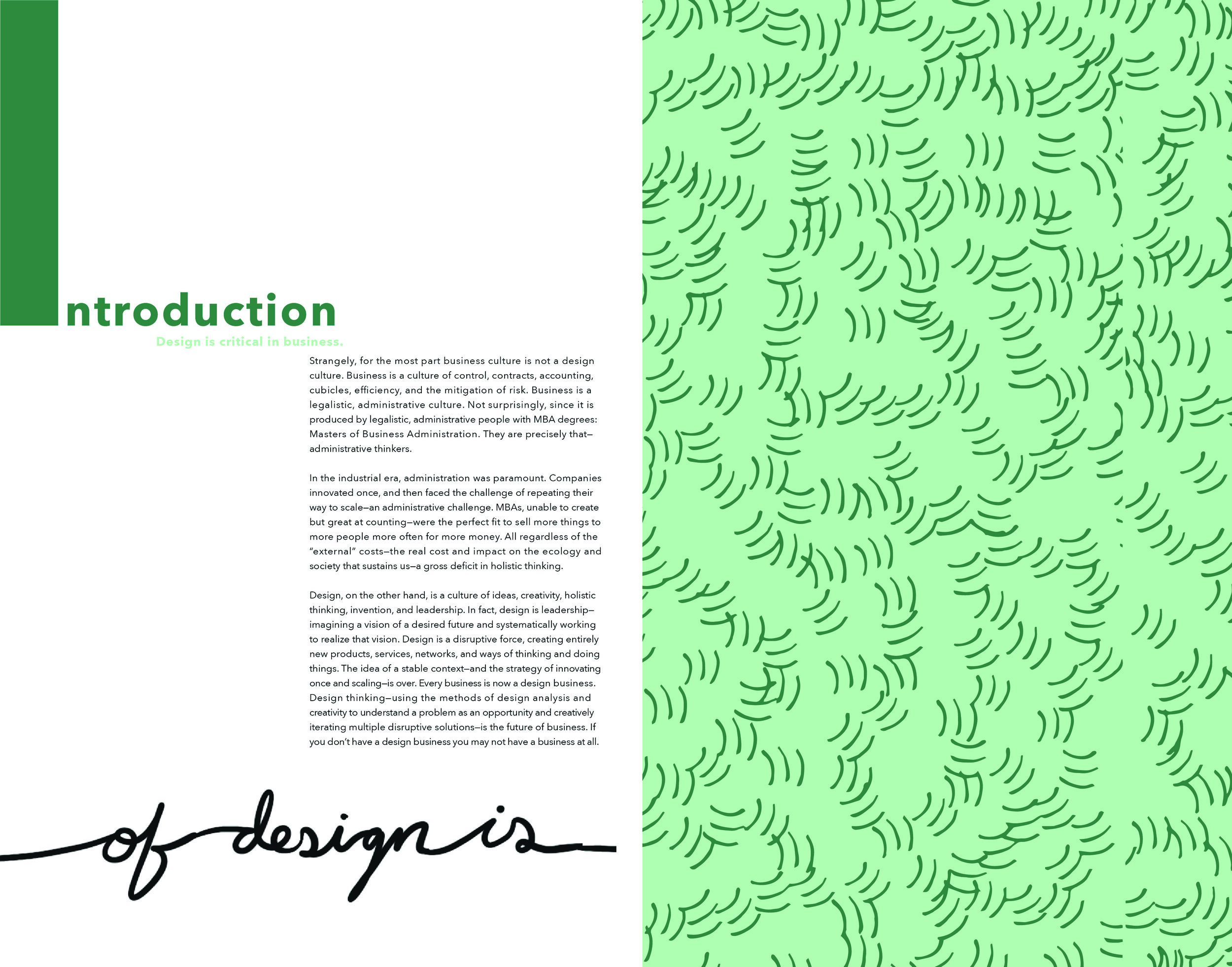
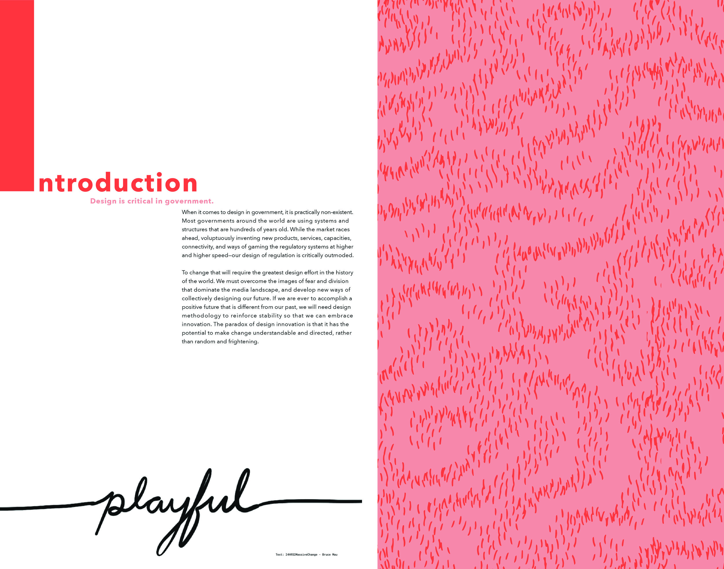
I consistently used simple patterns throughout the designs. Early on I limited my color palette to six colors: 3 main colors and 3 tints of the main colors. This lent itself well to creating patterns using the color pairing. I incorporated the patterns into some of the letter forms for texture, and used them again on the 4 introductory cards to distinguish them from the 16 cards I chose from Mau’s principles.


Flash Mob
At the conclusion to the project, our class hosted a pop-up house of cards “flash mob” to display our work. We came together and built one large structure using all of the cards in the class. This was our way of expressing how different each of us are as designers but also how we physically and literally fit together within a larger system.
Part of the campaign to bring awareness of the projects was to create content for a social media outreach. We decided as a class to use Instagram Stories as our outlet, because of their large audience and temporary nature allowed us to make more than one post. I decided to use simple animations that were representative of the visual style, and provided hints to what might be coming next.